Covid Mapping Part 2
The first post looked at how we can use the center of a Forward Sortation Area (FSA) into a Census Tract. However, as noted, this is a messy process. FSAs are large ares, see the Wikipedia page. Instead of this messy process, we can look at FSAs, and use Dissemination Areas from Census 2016 to fit those into FSAs. A complete guide to this process can be found on the Statistics Canada website, here.
Dissemination Areas (DA) are the smallest unit Statistics Canada reports. They usually range between 400 and 700 people.
This post first downloads the FSA shapefile from Statistics Canada. It then uses the cancensus package to extract median income, and other demographic data at the DA level.
The full code can be found here.
Getting the Data
The first step is to bring in the Statistics Canada shapefile. The shapefile is projected in the PCS Lambert Conformal Conic CRS. We need to change this to the WGS coordinate system. To do this, we use the sf package, and the function st_transform. This makes the coordinate system easier to use, and can also be used with the leaflet package.
s.sf <- st_read("C:/Users/Kieran Shah/Downloads/FSA/lfsa000b16a_e.shp")
shape_proj<-st_transform(s.sf, CRS("+init=epsg:4326") )

CovidTO = readr::read_csv("C:/Users/Kieran Shah/Downloads/COVID19 cases.csv") %>%
  count(FSA) %>%
  filter(!is.na(FSA))

shpe_proj2 = shape_proj %>%
  filter(stringi::stri_sub(CFSAUID, 1, 1) %in% c( "M") |
           stringi::stri_sub(CFSAUID, 1, 2) %in% c( "L1", "L3", "L4", "L5", "L6", "L7")) %>%
  left_join(CovidTO, by = c("CFSAUID" = "FSA")) %>%
  mutate(n = ifelse(is.na(n), 0, n))
The next step is to get the Census 2016 data. This is the same process as the previous post.
options(cancensus.api_key = "API Key")
options(cancensus.cache_path = "Path")

census_data <- get_census(dataset='CA16', regions=list(CMA="35535"),
                         vectors=c("v_CA16_2397",
                                   "v_CA16_4002",
                                   "v_CA16_4014",
                                   "v_CA16_4044",
                                   "v_CA16_4266",
                                   "v_CA16_4329",
                                   "v_CA16_4404",
                                   "v_CA16_4608",
                                   "v_CA16_4806",
                                   "v_CA16_425",
                                   "v_CA16_385" ,
                                   "v_CA16_388" ,
                                   "v_CA16_2552"    ), level='DA', quiet = TRUE,
                         geo_format = 'sf', labels = 'short')
After getting the 2016 Census data, we join the FSA shapefile, and the Census data. Similar to the previous post, we use the st_join function. We now have the DA for each of the City of Toronto FSAs.
To get the Census 2016 variables at the FSA level, we take the weighted mean, using population. FSAs vary in population, which is why we use the weighted mean.
The mean number of DAs per FSA in the City of Toronto is 59, with a median of 55, and a minimum of 7, and a maximum of a 119.
For the City of Toronto, there are 96 FSAs. Below is the same leaflet plot from the previous post, but using City of Toronto FSAs.
As we can see, the greater case loads are on the outer FSA of the City of Toronto.
Modelling
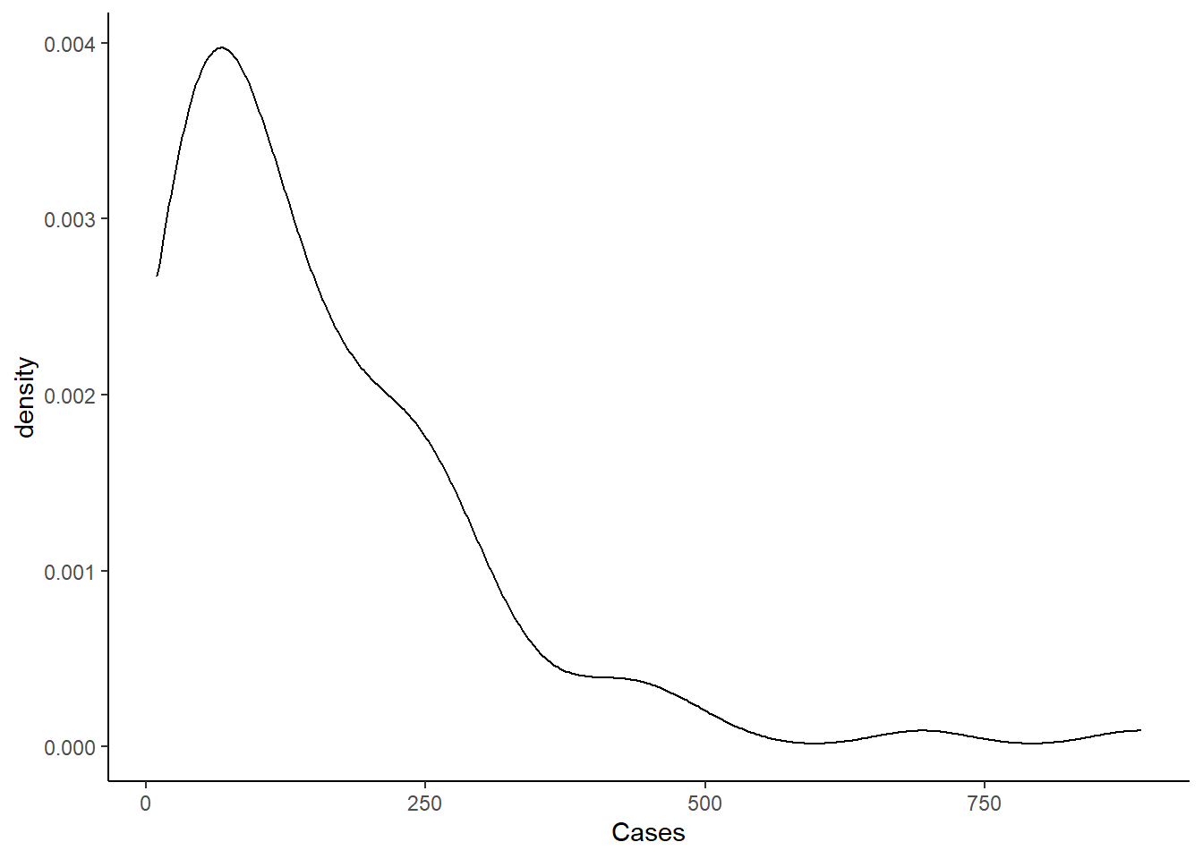
In the previous post, we saw a right-skewed distribution. The data is again skewed to the right. Instead of using a negative binomial model, or zero-inflated model, we will try skew normal family from the brms family.
We first compare the skew_normal model to a Gaussian model. Again, we use the get_prior function to get the skewness prior, and the other priors we need. When we compare Gaussian model to the skew model, the skew model is clearly superior to the Gaussian model using Widely Applicable Information Criterion (WAIC).
We also try increasing the alpha above zero to account for greater skewness. This model is in fact worse, and using the prior on alpha of 0 mean, and 4 standard deviation as the get_prior function recommends.
We next follow the same process as before, trying different parameters, and comparing the WAIC.
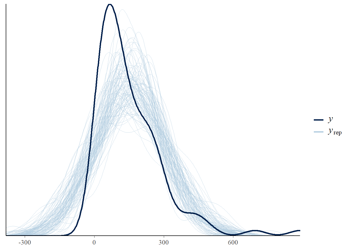
The plot below provide the posterior checks for the Gaussian model. We use the function pp_check. A good vignette can be found here. As we can see the Gaussian model does not fit the data well.
Next, we show the same posterior checks for the skewed model:
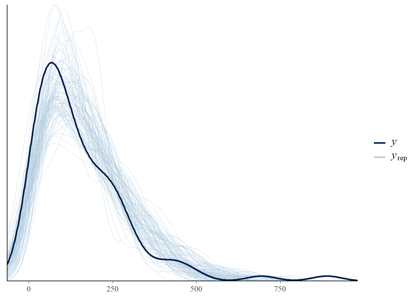
As we can see the data fit the model much better.
We next follow the same process as before, trying different parameters, and comparing the WAIC.
There is not a considerable difference between any of the models from two to five. There is no difference, and thus, we use the most parsimonious model, which is the second model.
| Model Names | Weight |
|---|---|
| SkewMdl_1 | 0.1292795 |
| SkewMdl_2 | 0.2415524 |
| SkewMdl_3 | 0.2162472 |
| SkewMdl_4 | 0.2100222 |
| SkewMdl_5 | 0.2028988 |
The final model includes:
- Median Income
- Share of different ethnicities as a percent of total population
- Household size
- Share of population older the age of 64
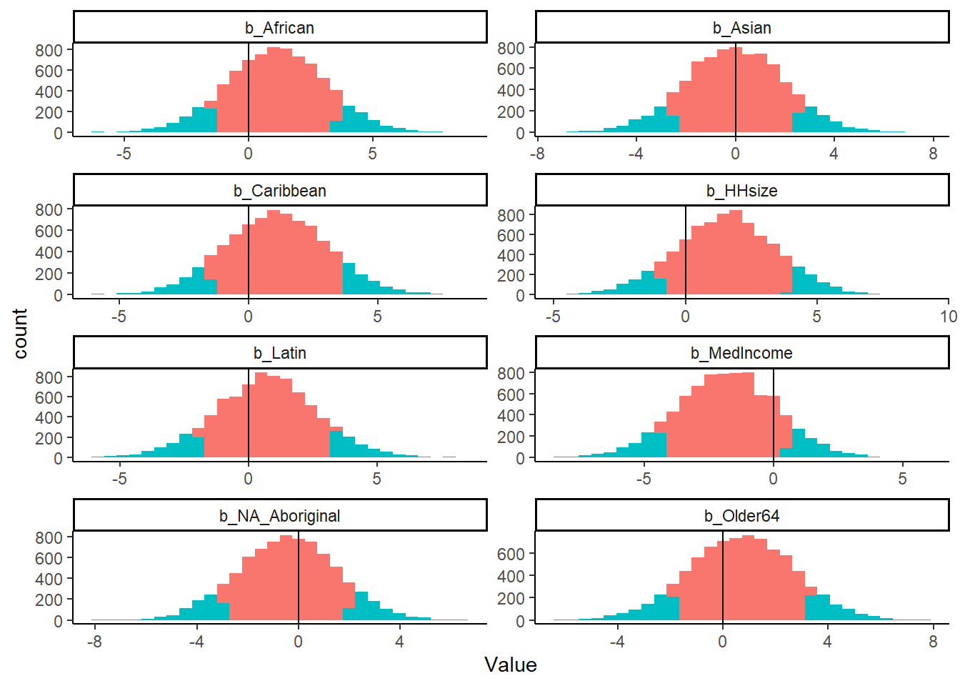
Below, we see the posterior estimates for the four parameters:
The plot below shows the distribution of the posterior for the four parameters. The red shaded area is between the 10th and 90th percentile of the posterior distribution. The blue is the tails of the posterior distribution. As we can see, the bulk of almost all the parameters’ posterior centers around zero, and no effect. However, again, we see that the median income parameter does have a considerable amount of its distribution below zero.
Finally, we again look at the predicted cases by Census District. Similar to the previous post, we look at Peel Region, there are 7513 cases as of August 25.
To extrapolate the Peel Covid-19 cases for August 19, we assume a constant rate of growth of 31 new cases over 15 days, which is 465. The skew model overestimates the actual positive Covid-19 cases by a considerable amount.
| CD_UID | Skew Normal Model |
|---|---|
| 3518 | 2165 |
| 3519 | 5204 |
| 3520 | 1339 |
| 3521 | 11137 |
| 3522 | 162 |
| 3524 | 2314 |
| 3543 | 491 |
| Total | 22812 |
Again, we map the expected Covid-19 cases for Census Districts that are not the City of Toronto. The range is very restricted. The minimum value is 157.6457024, and the max value is 177.3511793. This is simply because the model is not very good. All of the estimates are primarily based on the intercept.
Limitations
The analysis and Covid-19 testing limitations exist as discussed in the previous post. However, an added challenge is the polygon merge between the Covid-19 FSA shape file and the Census 2016 DA file is imperfect. There are a few FSAs which start with ‘L’, but are considered to be part of the Census District 3520, which is the City of Toronto.