City of Toronto Covid Mapping Project
The purpose of this post it to use the Open Data Toronto portal to use their Covid-19 data, and to first map the data, and second, bring in Census 2016 data to show correlations between income, and other demographic variables and Covid-19 positive cases.
The full code can be found here.
Get the data:
Anyone can download the data here. As mentioned on the website, it is important to note, that this dataset is updated every Monday morning.
Next, we use the very useful R package cancensus to get Census 2016 data.
Importantly, the only geographic variable in the City of Toronto dataset is Forward Sortation Area(FSA). To link the Census 2016 data, and the Covid data we could use the Statistics Canada PCCF file. However, the PCCF costs money. An alternative, is to find the center of each FSA, and then check whether that FSA is in the census tract polygon, provided by the Census 2016 data.
To get the center of the FSA, we use the neighbourhood name, and run it through the Google Maps API, using the R package ggmap. This gives us the latitude and longitude for all the FSAs.
options(cancensus.api_key = "CanCensus API")
options(cancensus.cache_path = "A Directory")

register_google("Google API Maps key")

## Bring in Covid Data:
CovidTO = readr::read_csv("C:/Users/Kieran Shah/Downloads/COVID19 cases.csv") %>%
  count(`Neighbourhood Name`) %>%
  filter(!is.na(`Neighbourhood Name`))

Long_Lats = ggmap::geocode(CovidTO$`Neighbourhood Name`)

Long_Lats_all = bind_cols(CovidTO ,  Long_Lats) %>%
  filter(!is.na(lon))

Covid_sf = sf::st_as_sf(Long_Lats_all, coords = c("lon", "lat"), crs = 4326)
As we can see, we need an API key. It is very easy to sign up and get an API key at this website.
After getting the Census 2016 data, we then use the package sf, to check whether the center of the FSA is within a given census tract. This post very helpfully explain this process.
census_data <- get_census(dataset='CA16', regions=list(CMA="35535"),
                         vectors=c("v_CA16_2397",
                                   "v_CA16_4002",
                                   "v_CA16_4014",
                                   "v_CA16_4044",
                                   "v_CA16_4266",
                                   "v_CA16_4329",
                                   "v_CA16_4404",
                                   "v_CA16_4608",
                                   "v_CA16_4806",
                                   "v_CA16_425",
                                   "v_CA16_385" ,
                                   "v_CA16_388" ,
                                   "v_CA16_2552"    ), level='CT', quiet = TRUE,
                         geo_format = 'sf', labels = 'short')

Covid_in_tract <- sf::st_join( census_data, Covid_sf, join = st_intersects ,
                               left = TRUE)

Covid_in_tract2 = Covid_in_tract %>%
  rename(MedIncome = v_CA16_2397,
       NA_Aboriginal = v_CA16_4002,
       Other_NA = v_CA16_4014,
       European = v_CA16_4044,
       Caribbean = v_CA16_4266,
       Latin = v_CA16_4329,
       African = v_CA16_4404,
       Asian = v_CA16_4608,
       Oceania = v_CA16_4806,
       HHsize = v_CA16_425,
       Less_15 = v_CA16_385 ,
       Btw_14_64 = v_CA16_388   ,
       Older64 = v_CA16_2552
)
The complete dataset can be found here. Note, the dataset is both a data.frame and a sf object. I have left the dataset has an R object for this reason.
The first plot shows the distribution of Covid-19 cases across the City of Toronto. As we can see, the highest tracts with Covid-19 cases are on the western border of the City of Toronto, near Brampton and Mississauga. The popup includes the median income percentile and the senior share percentile.
CovidMap_MapF = CovidMap %>%
  mutate(MedIncPct = ntile(MedIncome,10),
         Older64Pct = ntile(Older64,10)) %>%
  mutate_at(vars(MedIncPct, Older64Pct) , ~paste0(., "0 Percentile"))

cov_popup <- paste0("<br><strong>Covid Cases: </strong>",
                        CovidMap$Cases ,
                    "<br><strong>Median Income: </strong>",
                        CovidMap_MapF$MedIncPct ,
                    "<br><strong>Senior Share: </strong>",
                        CovidMap_MapF$Older64Pct)

bins <- c(0, 10,50, 100,200, 300,400, 500, 1000)
pal <- colorBin("RdYlBu", domain = CovidMap_MapF$Cases, bins = bins)

CovidMapLeaf = leaflet(CovidMap_MapF) %>%
  addProviderTiles(providers$CartoDB.Positron) %>%
  addPolygons(fillColor = ~pal(Cases),
              color = "white",
              weight = 1,
              opacity = 1,
              fillOpacity = 0.65,
              popup = cov_popup) %>%
  addLegend("bottomright", pal = pal, values = ~CovidMap_MapF$Cases,
    title = "Covid Cases",
    opacity = 1)


CovidMapLeaf
Distribution of Covid Cases:
Below is the distribution of Covid-19 cases by census tract. As we can see, the data is highly left skewed.
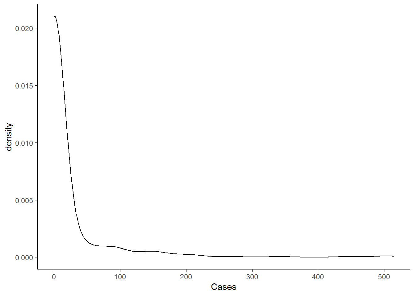
Below is the table that shows the distribution by category. As we can see, more than 90% of census tracts have zero cases.
| Distribution of Covid-19 by Census Tract | ||
|---|---|---|
| Case Groupings | Number of CTs | Percent of CTs |
| Zero Cases | 1043 | 90.854% |
| Between 10 and 49 | 37 | 3.223% |
| Between 100 and 199 | 25 | 2.178% |
| Between 200 and 299 | 6 | 0.523% |
| Between 300 and 399 | 2 | 0.174% |
| Between 400 and 499 | 4 | 0.348% |
| Between 50 and 99 | 30 | 2.613% |
| More than 500 | 1 | 0.087% |
Modeling:
The first step of the modeling process is to model counts of Covid-19 cases by Census Tract. We could use a Poisson model, but a Poisson model assumes that the mean and the variance are equal. The mean of cases in our dataset is 20, and the variance is 3903. The mean is clearly not equal to the variance.
Instead, we first try a negative binomial model. The brms can handle negative binomial data, with the family = negbinomial parameter. The negative binomial model allows for the variance to be bigger than the mean, unlike the Poisson model.
We test multiple models with different parameters. In the end, we choose the following predictors:
- Median Income
- Percentage Older than 64
- Different percentage of ethnicity
- Household Size
- An Interaction between median income and percentage older than 64.
Zero Inflation Models:
An alternative to the negative-binomial model is a zero-inflated model. The zero-inflation model estimates two processes. First, we are estimating the count of Covid-19 cases in each Census Tract as we would with a Poisson model. Second, we are estimating the zero cases data process as well.
It is unclear whether there are two processes for zeroes for this Covid-19. A perfect example of two data structures of zeroes could be an aggregate smoking dataset with both smokers and non-smokers. There are smokers who may be attempting to quit, and who may have a day with zero cigarettes. There are also individuals who are not smokers, who simply consume zero cigarettes because they are not smokers.
For our data it is possible that testing could generate to separate process for zeroes. First, there are Census Tracts which report zeroes, but this is simply because testing capacity was not available. Second, there could be zeroes in a Census Tract because there are not Covid-19 cases.
Compare Models
To compare models, we use the Widely Applicable information Criterion (WAIC), as prescribed here.
| Model Number | Negative Binomial | Zero Infalted |
|---|---|---|
| 1 | 0.207 | 0 |
| 2 | 0.096 | 0 |
| 3 | 0.257 | 0 |
| 4 | 0.373 | 1 |
| 5 | 0.067 | 0 |
Overall, we see that using the WAIC, shows us that for both types of models, the model which includes an interaction between the share of the population over the age of 64 and census tract median income, is the best model. When we compare the best model for both negative binomial and zero-inflated, the negative binomial model is better.
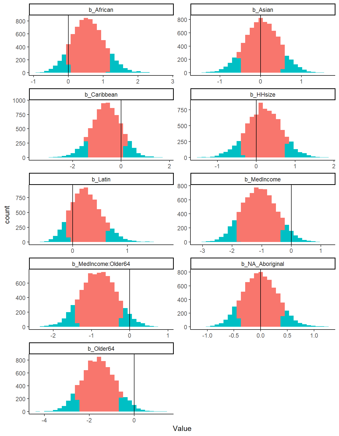
The plot below shows the posterior distribution for each of the parameters. We look at 90% credible intervals. The red shade below shows the distribution of the posterior samples between the 10th percentile and 90th percentile.
The choice of credible intervals is completely arbitrary. As we can see, there is no parameter, where the entire distribution of the posterior is different than zero. However, both parameters with median income exclude zero in the bulk of their distribution.
As the table below shows, the negative binomial model greatly increases the estimated case number based on the 2016 Census variables. The table shows that for all Census Districts within the Toronto CMA (except the City of Toronto), the negative binomial model’s estimates are much higher.
| CD_UID | Zero Inflation Estimate | Negative Binomial Estimate |
|---|---|---|
| 3518 | 862 | 1336 |
| 3519 | 2928 | 5510 |
| 3521 | 5271 | 10472 |
| 3522 | 60 | 186 |
| 3524 | 781 | 2761 |
| 3543 | 124 | 321 |
| Total | 10026 | 20586 |
If we look at Census District 3521, which is Peel Region, we see that there are 5271 estimated cases for the zero inflated model, and 10476 for the negative binomial model. According to Peel Region, there are 7513 cases as of August 25, and 31 new cases on August 25. The dataset we have from the City of Toronto was downloaded on August 10th, and reflected cases up to that date.
To extrapolate the Peel Covid-19 cases for August 19, we assume a constant rate of growth of 31 new cases over 15 days, which is 465. The negative binomial model considerably overestimates the reported Covid-19 cases, while the zero-inflated model underestimates the number of Covid-19 cases in Peel Region.
Limitations
There are serious limitations to this data. FSAs are large areas, and are much smaller than Census Tracts. Using the center of the FSA is an imperfect way to assign a Census Tract to an FSA.
Furthermore, there are many more limitations to the Covid-19 data. The dataset we have includes all Covid-19 positive cases as of August 10th. Testing policies varied from very stringent at the beginning of the pandemic to asymptomatic testing at the beginning of August.